Celebrated early 20th century American artist and teacher Charles Hawthorne valued sound academic principles, but he forbade his students to make underpaintings and then paint color on top of them (as most of the world’s traditional painters did and still do).
Hawthorne’s preference reprises a tension between color and drawing dating to the 15th century. During the Italian Renaissance, a rivalry arose over the importance of drawing versus the role of color in composing a painting; which mattered more became the subject of debates, or paragoni (Italian for “comparisons”). Painters in Florence and in Venice drew battle lines between colore, or sometimes colorito (color), and disegno (meaning both “drawing” and “design”).
Renaissance Rockstar Raphael was all in on designo; he boasted that he didn’t need to rely on color to create harmonious compositions. For him, colors, while beautiful, were secondary to clarity of form and flowing lines. In contrast, the Venetian master Titian used expressive color to define shapes and figures. He carefully balanced gorgeous (and often rare) colors to create a harmonious impression.
The stylistic and technical preferences for the designo and colore camps had a theoretical underpinning that persisted in 15th-, 16th-, and 17th-century writings. (source: https://www.oxfordartonline.com/page/1635)

Titian (left) is all about integrated color that radiates sensuality and mood, emphasizing glowing skin and sumptuous drapery. Michelangelo, primarily a sculptor, was much more concerned with line and drawing as the organizing principle; color for him was secondary, to be kept more true-to-life than expressive.
The “paragone” of art history in some ways carried into abstraction as well, with abstract expressionism (“action painting”) in distinction to “hard-edged” or “geometric abstraction,” though it played out in ironic ways; think Frank Stella vs. Franz Kline. (Stella painted hard-edged, carefully drawn and designed geometries yet he was all about color too; “action painters” like Kline made spontaneous canvases crackling with forceful painterly gestures, although Kline painted almost exclusively in black and white.)
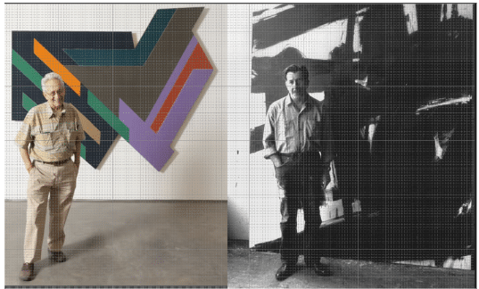
Frank Stella (left) and Franz Kline (right). Stella carefully planned his combinations of color and design with precision. Kline painted directly, allowing his active imagination and body to become part of the process, resulting in powerful paintings that often resembled a marriage between twisted urban geometry and a mysterious Asian-esque calligraphy.
It may seem just a “colorful” piece of art history (or maybe a pointless quibble). However, interesting things arise when you think about color as constitutive of form (as in Monet and Cezanne, for example) apart from the equally important roles of line, perspective, and drawing. It helps you think, and perhaps clarify, your own approach and intentions.
According to Hawthorne, painting is a sensitive instrument that records a unique artistic engagement with a subject, which is hard to argue with. It gets interesting when the best (only?) way to do that, he says, rather than “making form and coloring it,” is to paint directly, by simply observing and thinking in what he called “spots of color.” For Hawthorne, “real painting is like real music, the correct tones and colors next to one another.”
“A few large simple spots in right relations are the most important things in the study of painting,” he told his students. “No amount of good drawing will pull you out if your colors are not true. Get them true and you will be surprised how little else you will need….Do what you see, not what you know. Put down each spot of color truly and sincerely–remember that it is the large spot of color that tells the story.”
Hathorne’s method might apply quite well to plein air painting, but it’s only one side of the story. Draftsmanship – skilled and accurate drawing, whether it’s via a detailed preliminary sketch or value study, or blending on the canvas for that matter – is the other.
And most painters today say value (light/dark tones and contrasts – that is, designo) is a more important tool in composition than color.
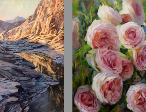
Lori Putnum, “Arroyo Seco,” oil. Designo or Colore?
Of course, nobody of note ever took the “Designo and Colore” debate too seriously for very long. They are, after all, simply two means of arriving at the same destination, are they not?
“Art is a necessity, beauty we must have in the world,” Hawthorne said. “Painting and sculpture and music and literature are all of the same piece as civilization, which is the art of making it possible for human beings to live together.”
You’ll find a trove of great teaching videos on plein air painting in a wide variety of styles and different approaches, including Lori Putnum’s, here.