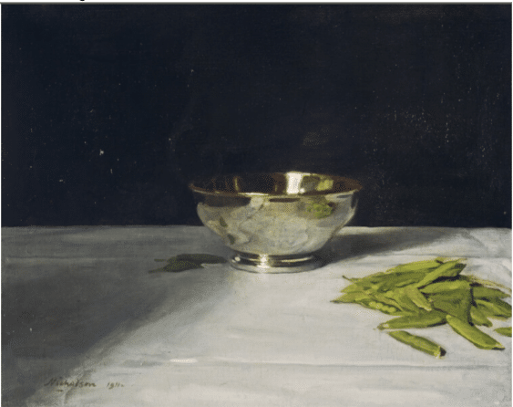
There’s something about this image that impresses itself on the imagination and memory. Somehow Sir William Nicholson’s simple still life paintings, this one being no exception, transform random, everyday items into indelible images with a mysterious timeless quality.
Nicholson painted mostly still lifes but he also made landscapes and portraits. One of his finest and most impressive paintings is his group portrait of five Canadian World War I officers standing unposed in front of the mural of a bombed-out cathedral.
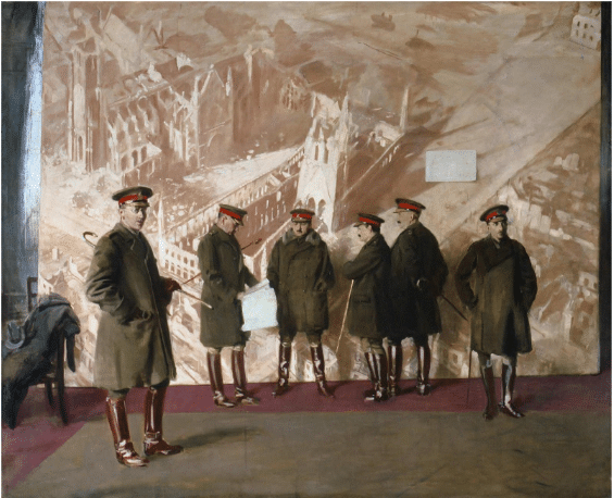
Sir William Nichols, Canadian Headquarters Staff, 1918, 95 x 113.8 inches. Canadian War Museum, Toronto
Supposedly unfinished, Nicholson’s Canadian Headquarters Staff was definitely unusual, and once Nicholson stopped working on it, it was quickly forgotten. However, when later rediscovered in the vaults of the Canadian War Museum, it was hailed as a masterpiece, the artist’s finest work. Nicholson captures the officers “standing around” in the moments before they were to pose for an official portrait. The imposing background mural of the destroyed cathedral looms over the figures, to my eyes diminishing their stature because of the disparity of the scale. The mural was based on a still from a newsreel documenting the destruction of Ypres cathedral in Belgium.
It’s very much not a group portrait, considering how aimless and isolated each figure appears, each standing alone, looking in a different direction, absorbed in private thought. To my eyes, the officers’ less than heroic portrayal shows them as “just people” caught up in history, literally disarming both subject and viewer. Nicholson was still working on this painting when his son Tony was killed a month before the end of the War. His other son, Ben, however, went on to become a celebrated abstract painter.
Sir William always remained in the realist camp, especially with his still lifes. What is it about that silver bowl and peas painting? Maybe it’s the strange mix of splendor and earthiness; the silver bowl and white fabric might recall a sumptuous dinner – or perhaps the chalice and altar cloth in a Christian communion service, while the peapods in their little pile seem so ordinary, random, and mundane. He clearly enjoyed the challenge of rendering the different textures and surfaces.
He’s not well known now because his paintings looked old-fashioned to mid-century audiences. Despite his modern interest in exploring the tension between representation and the physical reality of his paint, Nicholson typically pitched his paintings just on the safe side of the line – clear depictions of elegantly poised realities.
What’s special about his paintings now, I think, is their tension between modernism and classicism. He has an originality that arises from loose application of academic technique combined with a general refusal to copy arrangements or subject matter from the European tradition. He deliberately broke from the time-honored formulas. That’s why, to a contemporary sensibility, his still life paintings seem on some level to celebrate the artistic process in its purest form – painting from life with observation and originality. That’s what makes him a “painter’s painter” – he combines an impressive level of skill with authenticity and originally, which lends the paintings the feeling of being exemplary of the “essence” of painting.
So how does he do it? Let’s have a closer look at that bowl and tablecloth.
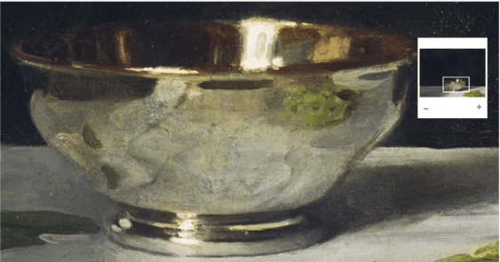
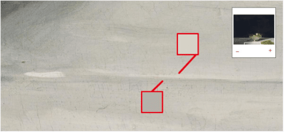
Here’s a closeup of the bowl – it looks like metal because of the reflections. Getting the reflections “right” comes down to the relationships between (in order of importance) 1. the light/dark values of the shapes and 2. the treatment of those shapes’ edges and 3. the colors, which have to match the surroundings while differing in, again, the all-important values and edges. Order of importance: values, edges, color.
The “luster” that convinces us the bowl is metal relies on two relatively smaller areas, the base and the rim/inside of the bowl. These do 90 percent of the work in convincing us we’re looking at a silver bowl. Below is a closeup of just the bowl’s base. As you can see, there’s a wide range of values involved – it’s mostly dark (warm black), then, rounding the curve, a bit of medium (probably yellow ochre and white added to the same black), with finally a smaller amount of light (white) concentrated at the highlight. The majority of the transition between the color-values are fairly abrupt (dark next to light without that much in between). The fourth square on the right samples an area that does get blended middle tones.
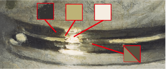
Detail of the base of the bowl showing color-values.
The next closeup (below) is the tablecloth. The only way we know it’s a tablecloth is because of the creases and folds in the fabric. Here, just two values are involved, but again it’s all about getting the values and their shapes and edges just right.
The simplified rule for fabric, based on this example, is a two-value combo – in any given crease or fold, a thinnish darker line runs alongside a lighter one. In the closeup below, the fabric at the crease in the foreground is darker toward the viewer because it tilts slightly down and away from us, while the area on the crease’s other side, further away from the viewer, catches the light.
Detail of foreground fabric crease showing color-values.
Which side (closer or further away from the viewer) gets the lighter and which the darker line depends on whether the fabric is a crease “pointing down” (as in the example above) or a fold “sticking up” (as in the example below). All of this assumes, by the way, that the light source is behind the viewer.
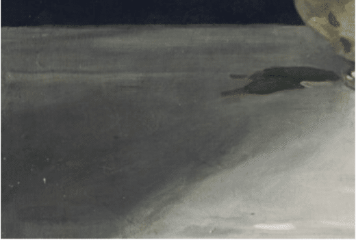
Detail of background fabric fold.
It’s fascinating how, in loose paintings like this, one or two good creases or folds makes a cloth out of what’s otherwise a whole field of mild dark/light variations. Those “supporting actors” are made by dragging a medium brush with a little bit of darker or lighter color-value through various parts of the rest of the “cloth.” The secret to “painting loosely” without departing from realism is fewer (unblended) strokes of slightly thicker paint mixed to convincing color-values, given exactly the right placement. Checking all these boxes lets you “put it on and leave it on.”
Still, lest we forget, for all this technical analysis, the painting’s real strength lies in what the artist did before ever touching brush to canvas. Just as in the arresting “Canadian Officers” war painting, it is the originality of the work, particularly the odd juxtapositions within the motif, that still ring true and keep us looking, thinking, and talking about this work.
Still life painting will probably never be out of style. If you’re interested in honing your own techniques, check out David Leffel’s video, Painting the Still Life Peaches with Delft Mug.
Drawing the Judge’s Attention
“Twilight Snow,” Shuocong Xiao’s drawing of snow-covered stones and mountains surrounding a thin ribbon of river won first place in the Drawing category of the September 202 PleinAir Salon Art Competition. Shuocong Xio’s Twilight Snow was done in pen and ink at 18 x 26 inches large.
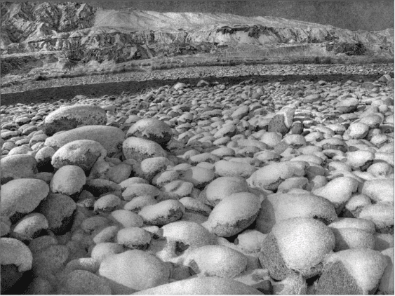
Shuocong Xio, Twilight Snow, pen and ink, 18 x 26 inches.
The monthly PleinAir Salon rewards artists with over $33,000 in cash prizes and exposure of their work. A winning painting, chosen annually from the monthly winners, is featured on the cover of PleinAir magazine. The deadline is ongoing, so visit PleinAirSalon.com


