There’s no clear line between “beginner” and “intermediate.” But there are a few “next level” things painters with more than, say, a dozen or so canvases under their belt can look for to get better. Beyond the basics everyone learns at the start, here are three key ways to level-up your paintings.

The Value Scale. You can do worse than to practice by painting one of these.
#1. Values. The last thing you should do with any painting is adjust the values: darken the darks and lighten the lights. Remembering to look at values apart from color is crucial. Most beginning painters haven’t yet developed sufficient control over contrast. It takes an experienced eye and hand to prevent a painting’s values from converging toward the “muddy” middle of the value scale.
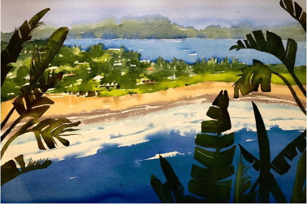
Georgia Mansur, “Palm Beach Vista,” watercolor
Note how bright the lights and how dark the darks are in Georgia Mansur’s painting titled “Palm Beach Vista” (above). If we were to water down her values (by dulling down the lights and washing out the darks) we’d lose so much more than you might suspect:
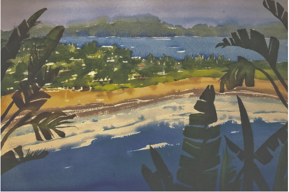
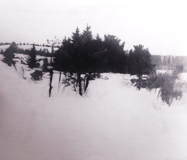
Values flattened toward the middle of the value scale.
THAT’s how important value is in your painting. By the way, if you’re ready to see and work with values, Georgia Mansur teachers her proven “3-Value” shortcut composition method in a video that you can preview here.
#2. Shapes – Not things. A lot of common intermediate painting mistakes come down to thinking too much about things and not enough about shapes: unconsciously making main subjects too small, arranging things too neatly, or dividing spaces too evenly. Thinking in terms of shapes not things allows you to treat lines and edges not as delineation but as opportunities to lead the viewer around and within the painting.
The golden rule is variety. It’s sometimes said that ideally no shape or size of anything should be repeated in a single painting unless there’s a good reason for it. Repetitive or parallel shapes tend to sneak up on you. Train yourself to be always zooming out and asking yourself, what are the shapes doing?
Intermediate painters realize there’s no need to struggle with details, at least until the big shapes are finished. It’s difficult for most beginners to stop thinking of their clouds as clouds or their trees as trees or their figures as figures, but they are shapes first and last. Paintings are two-dimensional arrangements of colors and shapes, and design is everything.
“Shapes” here means not the shapes of the things you’re painting, but the larger geometric forms your motif assumes, what their edges look like and, crucially, how they all fit together – that is, how the big shapes relate to the space around them and to each other. The only way to see this is to train yourself to see the things you’re painting not as the things they represent but as shapes they really are and how these shapes relate to each other.
For example, here’s the painting “Summer Twilight” by John MacDonald that appears at the top of this page. We’ve simplified it by dividing it into the big shapes:
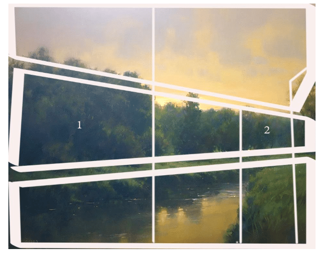
Variety in Unity. Detail of John MacDonald’s “Summer Twilight” at the top of the page.
Look how neatly these irregular triangular horizontal wedges fit together – and how they’re varied from thick to thin in alternating rows – NOT parallel horizontals. And they point us into the painting not out of it. Also note the built-in variety – the large mass on the left (labeled #1) is counterbalanced by a small mass on the right (#2). Not an accident.
MacDonald has related a dominant to a subdominant shape – instead of centering or adding two or some other number of shapes with equal or random visual weight. MacDonald teaches his techniques for doing this and more in his video, Dynamic Creating Landscapes.
The ability to see your painting as an arrangement of geometric shapes is a must. It’s just as important, if not more so, than training yourself to see and judge value apart from color. Of course, you also need to study the common qualities of successful compositions and designs to know what and what not to do with those shapes, but the number one thing it comes down to is variety. Simplicity, simplicity, simplicity and variety, variety, variety are touchstones of stronger and stronger beginner to intermediate painting.
Abbott Thayer stopped painting this much earlier than many an intermediate artist would have done. He knew better than to clutter a simple but very effective and satisfying composition.
#3. STOP
Knowing when to stop is a perpetual topic of discussion among students and teachers of painting. There’s no one answer. You’ll hear all manner of advice: It’s something you feel. Stop at the thought of stopping. When you think you’re 95% done, put down the brush because you’ve already painted past the proper stopping point some 10-20 minutes ago. Paintings are never finished; they’re just abandoned in interesting places.
In general, spend less time on detail and more on values, shapes, and expression, and, as “they” say, touch a painting as few times as you can.