Have you been dogged by a nagging feeling that something’s wrong with a painting you’re working on? Not just “off” or “not great” but something fundamentally, foundationally wrong? Very often, your problem isn’t the drawing or the color, value, brushstrokes, or surface details. Often it has to do with composition and design – you know, the underlying structure without which any painting lives or dies. This is part one of a two-part survey of some ways that simplifying composition by working with big shapes can improve your portrait, figure, landscape, and still life paintings.
One of the more helpful ways to learn good composition (or to deal with a bad one) is by thinking in big shapes. Try reigning in a wonky composition by breaking its features down into just 3-5 shapes. Think in terms of geometry here. They’ve got to fit together like puzzle pieces but no two of them should be too similar in size, distribution, angle, edges, etc.
This is where knowing the difference between composition vs. design is helpful. You can think of composition as the overall arrangement of big shapes. Design then would be the visual development within and across them, often through patterning and compositions-within-the-composition. The guidelines of good overall composition apply to the design elements as well.
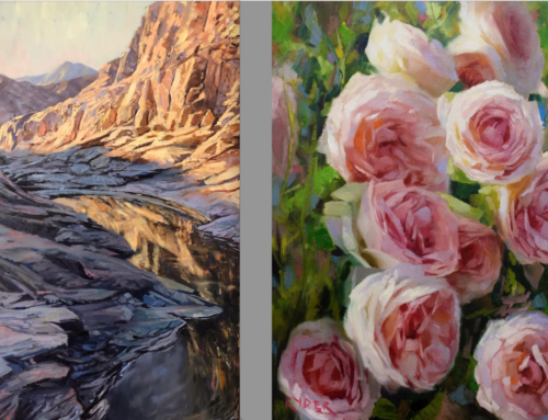
What do artists mean by working with the Big Shapes? Let’s take a landscape as an example.

Paul Kratter’s “Schwabacher’s View” ignominiously diced and sliced into four Big Shapes.
We can divide Paul Kratter’s painting titled “Schwabacher’s View” (above and at the top of the page) into three or four Big Shapes like so. The red shape at the bottom is subdivided by the red/orange line because you could see it as the two interlocking shapes that it is or further simplify by treating as just one Big Shape of three. A former commercial designer, Paul Kratter teaches. his students to start with a sketch – that way you get the most engaging elements in the best arrangement first.
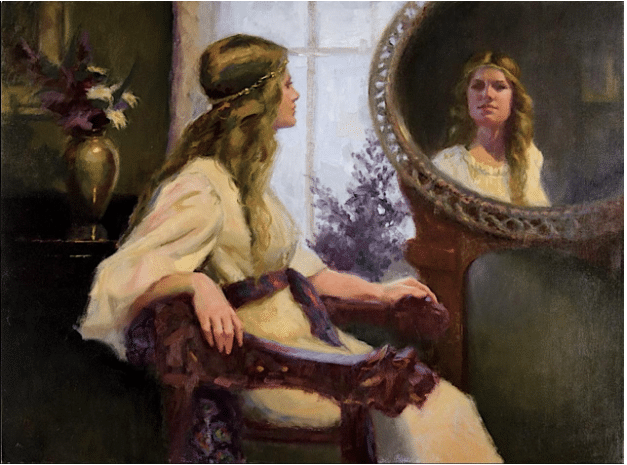
William A. Schneider, Lamia Transformed, oil, Available at New Masters Gallery
In William A. Schneider’s figure painting above titled “Lamia Transformed,” we can discern five main Big Shapes by looking for the edges. There’s of course overlap in the details but in terms of geometry, this is the abstract structure underlying the painting.
William A. Schneider teaches color theory, Andrew Loomis’s scheme for tonal organization (thinking and composing in four basic tonal values), the Pythagorean harmonic armature, ratios and a host of other systems and structures that take the guesswork out of composition. Yet, his paintings too can be simplified into those 3-5 key Big Shapes.
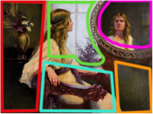
There’s an even simpler arrangement here: you can divide the painting into three tall (rough) rectangles from left to right. That’s not as helpful though as dividing it into five and then seeing how the design elements within those shapes supports the painting and really makes it what it is. Note how in “Lamia” the segments of the composition in the center (note the edges) have the lion’s share of eye-catching design elements – it reinforces the stability and balances the whole.
In Part 2 of “Thinking Big,” we’ll examine two other painters, one a portraitist and one a still life painter to see if we can see the same principle in action across the board.
Again, check out those teaching videos from Paul Kratter (landscape)and William A. Schneider (figure).