1. Turn Up the Contrast
Darken your darks and lighten your lights. When you finish a painting, the last thing you should be to adjust the values. Darken the darks, especially, and maybe turn up the juice on a few of the lights. It’s astonishing how easy and common it is to end up with all of your painting’s values sitting in a narrow range somewhere in the middle of the value scale.
Next time you’re unhappy with what should otherwise be a decent painting, ask yourself if you have incorporated a full range of values. Make sure you at least have something very dark and something very light – and if you want drama in your paintings, put them next to each other. To do this, you have to stop looking at the subject and comparing your painting to it – and just look at the painting itself, the way any random viewer would (and will) do.
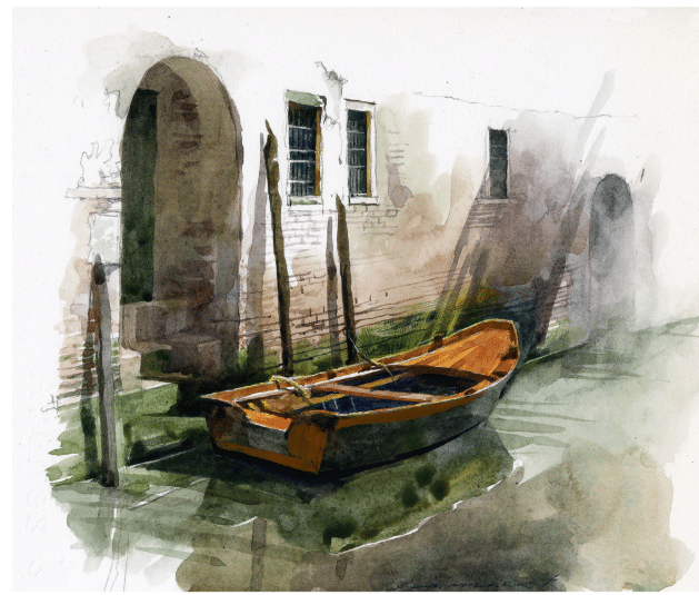
Consider “Charles,” a 24×36 in. watercolor by Stan Miller (below). Look at how rich and varied the lights and the darks are, how they play off each other in both subtle and dramatic ways.
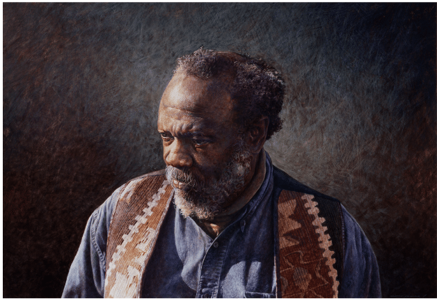
Stan Miller, Charles, 24×36 in, egg tempera
The lower right and lefthand corners are densely dark, and so are the shadows in the figure’s clothing. In fact, many of the shadows are much darker than you might think to make them if you were just looking at the model and not thinking about the importance of light-dark values (it’s no coincidence that the most effective value adjustments often happen at the end, when you’re looking at the PAINTING instead of the model or the subject itself. Look also at the serious contrast between the lightness of the embroidered vest vs. shadow next to it. Big contrast = eye-catching and convincing detail.
2. DESIGN, DESIGN, DESIGN.
Become a better composer. Design is perhaps the least intuitive and the most important aspect of painting. Composition happens when you arrange and crop your subject, but good design demands that you take into consideration every line, shadow, shape, edge, and even visible brushstrokes and ask yourself what direction they’re sending your eye in and why. Everything in a painting points somewhere – every line is a directional line. Work with that – the goal here is to keep the eye moving within the painting – that is, to keep the viewer’s looking from leaving and going to someone else’s.
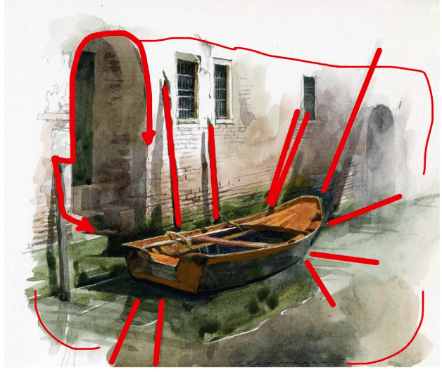
Stan Miller, Venice Study 10 x 11 inches watercolor.
As you can see in the mark-up below, Miller’s “Venice Study” is also a study in design. The work’s composed with the main subject – the boat – at the center and everything else is designed in such a way as to support this. This design ensures the eye knows where to go – toward the boat – and where not to go (outside of the painting). EVERYTHING points us in toward the middle of the painting, riveting us to the subject. NOTHING points us toward the edges or lets us leave. It’s a masterful composition.
3. Be Yourself
This is the hardest of the three and the least likely to yield instant gratification, but in the end it matters more than anything else. You have to be yourself in your work. It’s that simple and that difficult. Learn the rules and channel all the “good” paintings you’ve seen, it’s good for you in so many ways! And if you want to be the best painter you can be, also ask yourself are you putting yourself in your work? Do your paintings reflect your core beliefs about life and what’s important to you?
In the portrait below by Stan Miller (rather disingenuously titled “Heather’s Blue Sweater – I mean, we only get a teeny glimpse of the garment anyway!), it’s what Stan saw in the model and what he managed to get into the painting of what he saw that makes it good. It’s not the likeness, nor is it the degree of realism. What makes this a compelling painting, something you want to keep looking at, is the personality, the psychology, the secret history of this human being that he saw and had a feeling for. And mind you it’s not just “her” either – it’s more universal than just one person’s personality. It’s got something to do with the vulnerability, the introspection, the delicacy and the fleshiness and the tilt of the head – all of it – the way so many emotions seems to chase each over the young woman’s face like flecks of sunlight and deep shadows on water. Because Stan saw with feeling and trusted what he saw, this painting tells us something about humanity, about compassion and empathy and what people are really like and how beautiful it can be that someone can SEE that and express it so it can be seen by others willing to see with the same compassionate vision and cherish the magic of it all forever.
Sure, such things can’t be taught, but they don’t have to be – we know them already – we all do – we’re all sensitive, thoughtful and capable enough to feel and understand these things without being told how to.
What takes time and patience, dedication and many hours of introspection, is learning to recognize these things when we perceive them and learning to trust that they’re important and real enough to share – and that we are worthy enough to share them.
That is what it means to be an artist.
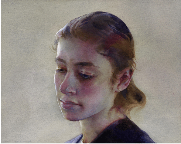
Stan Miller, “Heather’s Blue Sweater,” 10 x 12 watercolor
Stan Miller shares his techniques for capturing feeling, memories, and painting the portrait in two different videos available here.