Abstraction isn’t unique to landscape painting, but the natural world does wonderfully lend itself to the approach. When we consider nature’s range of light and her many atmospheric moods, her variety of colors, shapes, and textures, we realize how much of nature readily encourages abstraction.
Many painters, even those who work representationally, are drawn to abstraction. An abstract or semi-abstract painting can be interpreted on multiple levels, deepening the viewer’s experience. “Abstraction generally involves implication, suggestion, and mystery rather than obvious description,” said Canadian artist and writer Robert Genn (1936–2014). “Like a good poem, a good abstraction attacks your feelings before your understanding.”
Scott Gellatly, “Light in Refuge,” 2020, oil on panel, 21 x 45 in
Abstraction is never an arbitrary act. It requires a visual orientation that prioritizes aesthetics such as color, shape, or movement over the representational story. In Scott Gellatly’s work, color is the primary aesthetic. Speaking of his wetland subjects, he says, “I am particularly drawn to the way the richly textured landscape is reflected in the adjacent waters, distorting form into pure shape and color. I use color to depict luminosity, which elevates the light in the scene as the central subject matter.”
What Makes a Painting Abstract?
We all know an abstract painting when we see it, but why do we experience it that way? Every painting — whether strictly representational, fully abstract, or somewhere in between — is built upon certain aesthetic devices such as value, color, composition, pattern, shape, and so on. In a representational work, these aesthetic devices are firmly attached to the subject, giving the picture the descriptive power necessary for it to be recognized as that subject. As the narrative plays a more recessive role, and the primary visual experience shifts to one or more of these aesthetic devices, the painting becomes increasingly abstract.
What’s the first thing a viewer will notice?
One way to evaluate the effectiveness of your abstraction is to ask: What’s the first thing a viewer will notice? If it’s the representational subject, then the painting still lives primarily in the representational world. If the first thing they notice is an aesthetic (shape, shape, color, pattern, movement, etc.), then the painting is likely more abstract than representational.
The paintings featured here are all semi-abstract. They still maintain a foothold in the representational world. By seeing representation and abstraction in the same painting, we can better understand where representation leaves off and abstraction begins.
Inducing Abstraction
For many artists, moving toward abstraction can be elusive. There are three common ways painters can generate an abstract aesthetic in their work. Applying any one of these can put us on a path toward abstraction, but more times than not, several are at play, as we will see in the paintings shown here.
- ultra-simplification and reduction of detail
- expressive and/or textural mark-making
- color alteration
There is also another essential ingredient required to build effective abstraction — a strong visual concept. We’ll look at this more closely after we review the three ways of inducing abstraction.
Ultra-simplification
In its raw, unedited state, the natural world is so vast and complex, the painter has no choice but to simplify. The painter translates the subject into something more organized and coherent to the viewer. This is routine simplification, which differs from ultra-simplification, or simplifying in the extreme. When a painter simplifies in the extreme, they give up even more narrative information and detail. This leads to the dissolution of subject matter and to greater abstraction.
Ultra-simplification also makes shapes a visual priority. With simple shapes (and not too many of them!) the eye can take in the composition in an instant. This leads to a perceptual experience that can take viewers to a place that is beyond subject. Of the three methods outlined here, ultra-simplification is perhaps the easiest to implement.
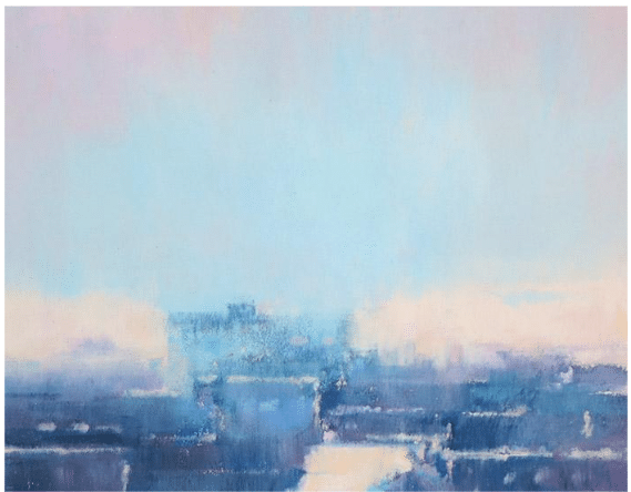
Mitchell Albala, “Salmon Bay Under a Pink and Turquoise Light,” 2022, pastel on paper, 4 x 7 in.

To interpret such a sprawling and complex urban scene abstractly, I first imposed a tight focus. This eliminated all but the most essential compositional ingredients. Then I downplayed nearly all detail, leaving just enough to imply an urban setting, but not so much that it drew attention away from the primary visual intent: bold, simplified shapes of color and light. Simplified shapes take priority.
Expressive and/or textural mark-making
Whether observing the world directly or in a photograph, we don’t see its many colors and shapes as gestural strokes with visible impasto-like relief. These are strictly painterly conventions. When strokes or marks become highly activated, we are supporting abstraction in two ways.
First, it adds a dimension to the painting that doesn’t have a visual correlate in reality. Second, expressive or textural mark-making brings greater attention to the surface itself, which can flatten the image. This can generate abstraction because it suppresses the illusion of space that is so much a part of representational painting.

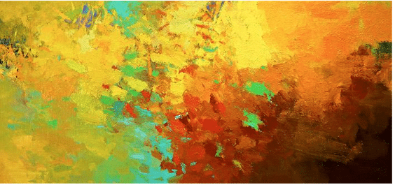
Sandy Ostrau, “Festival of Color,” oil on panel, 6 x 6 in.
When the artist applies paint liberally and with such directional energy, the picture becomes less about a landscape and more about the elements of painting itself. Ostrau’s small piece is a striking example of how a visual aesthetic can become the dominant force of the painting and generate abstraction.
Color Alteration
One way we experience a subject as representational is through a naturalistic interpretation of color; meaning, the colors in the painting align with how we expect them to appear in reality. All landscape painters modify colors, but if we deviate enough from the naturalistic colors we see in nature, we break down representational cues, which can heighten the abstraction.
One very common way painters alter color is with highly saturated colors. With rare exception, Intense and chromatic color is not what we see in nature. A strategy based on highly saturated colors, therefore, can be an effective way to push beyond representation and induce an abstract aesthetic.
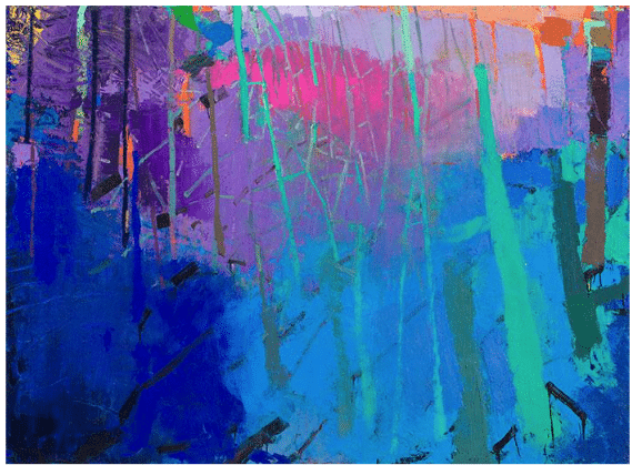
Brian Rutenberg, “Gardenia,” 2017, oil on linen, 60 x 82 in. ©Brian Rutenberg, Courtesy of Forum Gallery
Rutenberg frequently uses chromatic color to support his abstraction. “The last thing the world needs is another painting of a tree,” explains Brian. “What it needs is one person’s experience warmed up and worn-in. Forcing together saturated colors that don’t go together creates a transference of energy, as if the painting is being made as you look at it. Wild color embodies rage for life. I can’t think of a better starting point for abstracting the landscape.”
Envisioning the Abstract
The three modes of abstraction reviewed here — ultra-simplification, expressive/textural mark-making, and color alteration — can all move us in the right direction. Yet there is another essential ingredient that is the more important than all of them — a strong visual concept or vision.
Abstraction is very much a viewpoint that needs to be envisioned at the outset. What is the abstract idea? Can we heighten abstract qualities that are already in the subject? What aesthetics will take precedence over the narrative? Answering these questions requires an ability to think outside the box, and a willingness to let go of preconceived notions about what a subject should look like — which is the most difficult perceptual leap a painter can make.

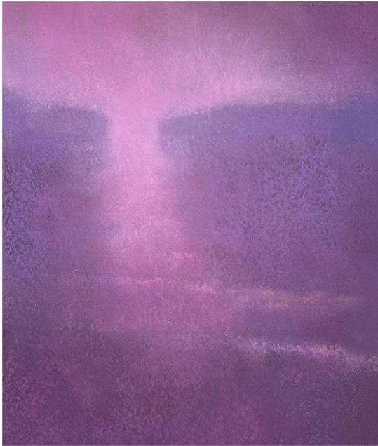
Mitchell Albala, “The Lighthouse Keeper’s House,” oil on canvas, 38 x 32 in.
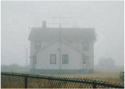
Abstract or semi-abstract paintings are, at their best, never about nouns, the narrative elements that populate our pictures. They are about the verbs and adjectives of the painter’s language, such as shape, color, light, movement, pattern, and so on. The initial vision for The Lighthouse Keeper’s House was that of a massive rectangular form hovering within a thick, atmospheric veil. The source image hints at this, but to fully express my vision, I would have to exaggerate that effect. Color choices, plus a textural surface and an ultra-simplified composition, all work to support the abstraction. See the demonstration for this painting: Abstracting Nature Demonstration – Development of an Abstract Landscape.
Mitchell Albala, “Dawning Dream,” pastel on paper, 8.5 x 7.25 in.
This small piece employs all three modes of abstraction: an ultra-simplified composition with no details, chromatic color, and even subtle textures produced as the pastels react to the textured paper. At best, the subject is implied. Shape and color become the primary visual experience.
This article was first published on Mitchell Albala’s award-winning artist’s blog.
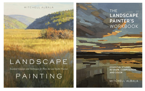
Mitchell Albala is a landscape painter and instructor, and the author of two best-selling books: “Landscape Painting: Essential Concepts and Techniques for Plein Air and Studio Practice,” with nearly 60,000 copies in print; and “The Landscape Painter’s Workbook” which is currently the #1 selling book on landscape in the nation.

Douglas Fryer, Cliff Face, oil, 18” x 11”
Douglas Fryer is one of the leading abstract landscape artists in the U.S. Here you can download his complete start-to-finish (and everything in between) instructional video, Painting with Intuition.
Additional Resources
See more work from the painters featured in this article:
brianrutenbergart.com
sandyostrau.com
scottgellatly.com
Check out a free video: Douglas Fryer on Painting with Intuition (Premiere VIDEO)
Or watch Douglas Fryer be interviewed by Charlie Hunter.