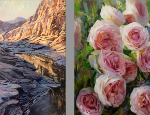
So often the reality of our paintings falls short of our ability to envision them – we can “see” the most beautiful paintings in our imagination, but in reality, that beauty eludes us. It’s often an issue with controlling value and just as often, color. Both value and color can make or breaks a painting. Only artists who have studied color, worked with it, and learned its properties firsthand can use it well.
Most beginning to intermediate painters proceed by guessing what works. Maybe they get lucky, but if not, the painting’s “off key” – their colors clash and tangle, go too dim or glare, push, pull, or step all over each other – and the artist learns very little about why or what to do differently next time.
Colors chosen carefully, informed by a sound grounding in theory and practice, can “play nice,” in harmony with each other. The right color combinations convey mood and feeling the way music can, pulling emotional and associative strings in the mind and soul of the audience for your work.
With this in mind, we’ve selected a number of books and videos addressing the mysterious laws of color.
BOOKS
JOHN POTOTSCHNIK: UNLIMITED COLOR WITH A LIMITED PALETTE BOOK
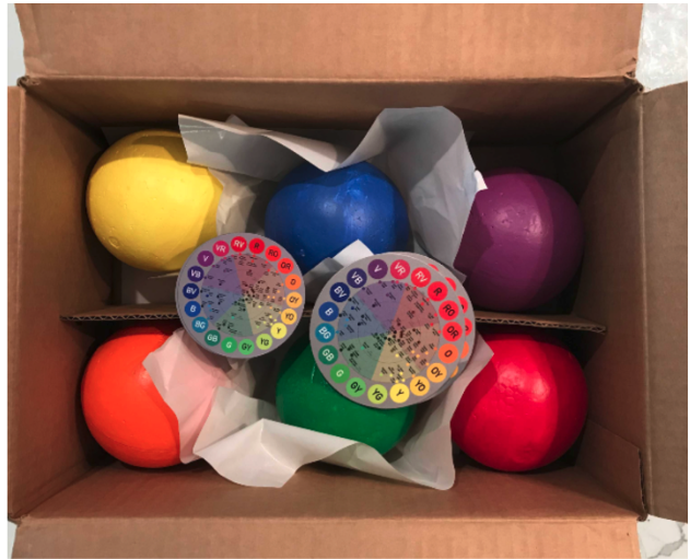
As a handbook for mixing colors, Unlimited Color by John Pototschnik is a popular classic. The heart of this book / workbook features 46 paintings divided into seven major divisions of the color wheel: Complements, Equilateral Triads, Isosceles Triads, Square Quadratics, Rectangular Quadratics, Extended Analogous, and Primary Dominant. Each painting was created using the same three primary colors, plus white. In addition, the subject, composition, and basic value structure of the paintings are the same, the only thing that changes is the color scheme.
The book comes with a clear palette so you can mix colors right over those shown in the book. It’s like a gourmet cookbook for paint artists who wish to expand their world of color.
TODD M CASEY: OIL PAINTERS COLOR BOOK HARDCOVER
In his book, “The Oil Painter’s Color Handbook,” realist Todd Casey presents information that every art school with an oil painting program should teach and every student of painting should learn. This book breaks down the subject of color into pieces of often neglected knowledge that painters can put into practice immediately.
He analyzes color not in terms of light and value, but also addresses pigment, mixing strategies, palette arrangements, and actual painting techniques affect color. Each topic is clearly and succinctly explained in the text, illustrated with captions, charts, diagrams, and finished paintings.
“By the end of the book, the reader will have a clear understanding of how realist painters and illustrators have used color through history,” says James Gurney, artist and author
VIDEOS
KYLE BUCKLAND: COURAGEOUS COLOR
It’s amazing what you can do with only eight colors plus white … using five tube primaries and three earth tones (colors Kyle considers toned-down versions of his primaries), you can quite simply achieve color harmony every time you paint. You have a built-in fail-proof system for great painting results.
Kyle Buckland can show you how to confidently mix expressive color using an easy-to-understand limited palette. He will equip you with the knowledge you need to overcome the hesitation sometimes experienced when choosing bold color combinations in your work. And he’ll show you how to control color so that it evokes an emotional response to your paintings.
After a review of the simple palette and tools you’ll want on hand to get started, Kyle teaches you the language of color — what words to use to describe color accurately, what different kinds of colors can do for you and what you want to say in your painting, how to find your style through your use of color, and more. As Kyle says, “Color is a language that transcends all boundaries.”
JOHNNIE LILIEDAHL: UNDERSTANDING COLOR
In Johnnie Liliedahl’s videos you will learn, simply by observation, what a color is by its generic definition and what colors are necessary to mix it. Understand this and you can mix any color you desire. After Johnnie’s video, you will never have to buy browns, greens, or other earth colors again.
An included video insert page provides study exercises that can make you color-savvy and provide you with an invaluable color reference that you can use for the remainder of your painting career.
In the days of the great art academies, students spent an entire semester-long class doing nothing but painting color swatches. Learning every possible color combination, and every possible shade, was that fundamental and important.
In these videos, anyone can learn what a color is, how colors relate to each other, and how to mix and apply them appropriately on your own canvases.
A COLORIST’S GUIDE TO PAINTING
Camille Przewodek, oil
Seeing and painting color may seem like an obvious part of any painting, but when you are a colorist, it’s the fun and focus of everything you do! A colorist’s goal is to paint the quality of light on a subject with arresting, unexpected colors harmonizing and setting each other off.
Camille Przewodek worked with her students to develop a new color perception for exciting results. An insightful workshop teacher, Camille taught that talent is 10%, while 90% is practicing and getting the right instruction. The good news? Color can be taught!
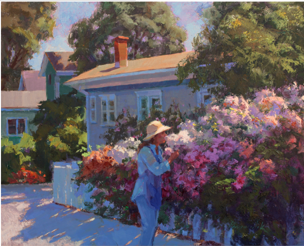
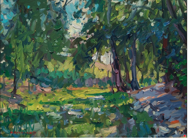
Camille Przewodek, “Floral Diversion,” Oil, 16 x 20 in.
Camille was a Signature Member of the Laguna Plein Air Painters and the California Art Club; and a Master Signature Member of the American Impressionist Society, Oil Painters of America, and American Women Artists. Her approach to capturing the colors and light effects of nature garnered extensive coverage in numerous books and magazine articles, and her paintings have been featured in national ad campaigns for clients Alfa Romeo, Target, Loews Hotels, and others.
In her teaching videos, Camille shows how light affects objects and how light temperature changes. One of her most interesting and radical tenets is that the first color you put down is the key to the entire painting.
“At first, this may seem very new as you have not seen this in other workshops, so just stay with me,” says Camille. “After you have done this for a while, it will make more and more sense.”
Starting with a review of objects under different lighting conditions and times of day, Camille guides you step by step to paint a sunny morning landscape. She focuses on capturing the illusion of light on structure and form, and not getting hung up in the details. The result is the ability to paint faster and more efficiently, and with the joy that color can bring.
“I am inspired by how light falls on objects,” she says. “Before I paint something, I have to be inspired. I will see it in my mind’s eye and then try to go for it. I don’t always accomplish it, but when I do, it is magic.”
Check out Camille’s teaching video here.