
Connecting your darks may not be a well-known compositional rule, and surely it isn’t always going to apply. It is, however, a great way of satisfying the time-honored goal of creating a fluid “path for the eye” through your painting.
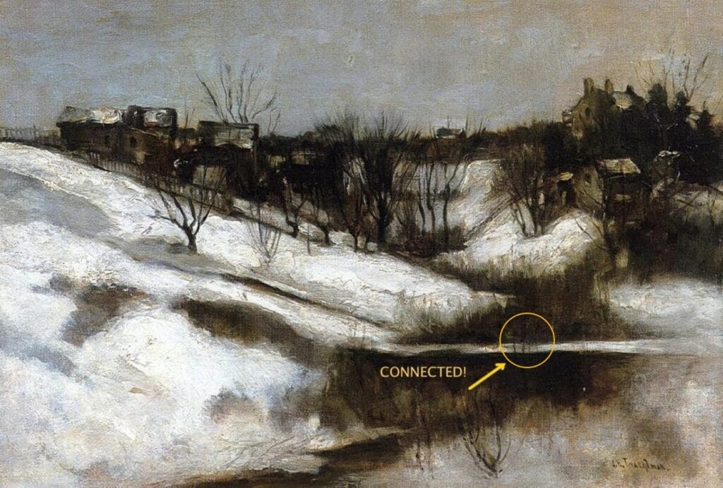
In this wintry landscape painting, artist John Henry Twachtman has literally connected the darks – I chose this example because he even used the thin tree trunks to bridge the otherwise divided foreground mass. Connecting all three of the composition’s large central masses enables even this pared-down, natural-looking landscape composed of seemingly random or casually arranged natural elements to work better than it would; it has this secret underlying abstract scaffolding. He didn’t have to connect these masses – but doing so keeps any element from being “stranded” from the others and left out in the cold, as it were.
I say “darks” because color is not an issue, only value. Being conscious of this principle forces you to consider how the elements of your composition are working together. Thinking in terms of fluid and dynamic two-dimensional design allows for flattening the picture plane, laying the foundation for abstract design.
Now let’s look at two paintings by nineteenth-century French painter Gustave Cailabotte.
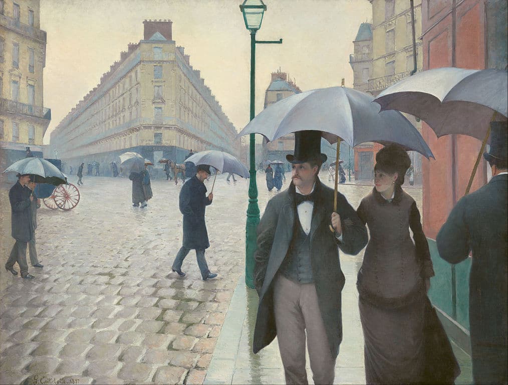
Gustav Cailabotte, Rainy Street in Paris, 1875
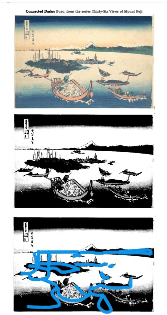
Here the artist has scrupulously organized the otherwise chaotic elements of a rainy street scene in Paris. (The conscious artificiality and symmetry of the arrangement is a big part of the painting’s appeal and also what at the time was strikingly modern about it). If we remove the color, we can see how all the shapes connect, leaving nothing stranded or isolated.
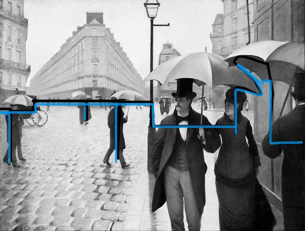
There’s a continuous line between the darker elements. The pedestrians on the left are not disconnected shapes liable to cause the eye to bounce between isolated elements in no particular order. No dark left behind.
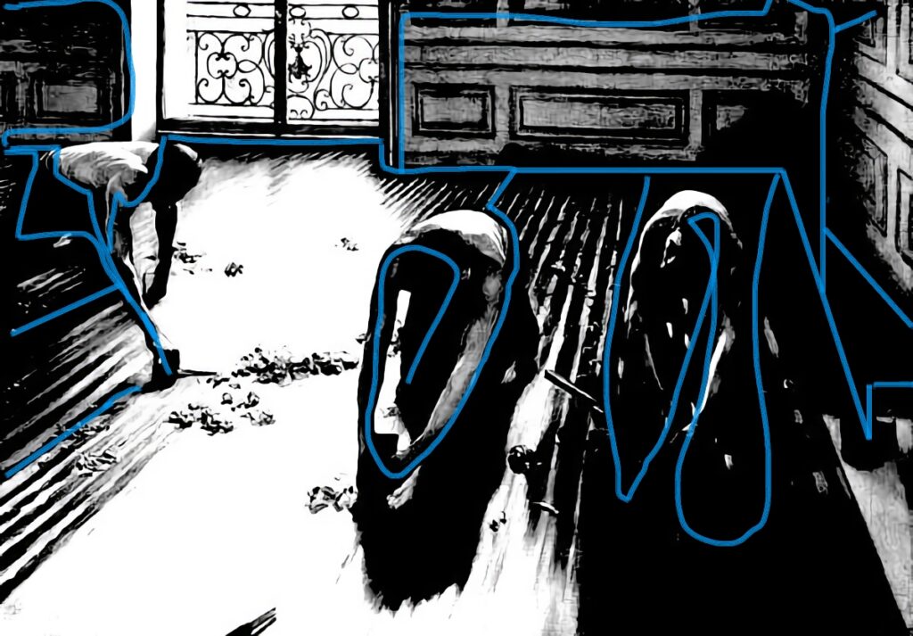
Same applies to the next Cailabotte, the spectacular and Sargent-esque Floor Scrapers of 1875.
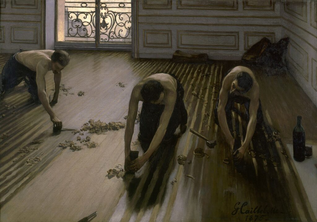
Gustave Cailabotte, The Floor Scrapers, 1875
In artificially high contrast, you can follow an unbroken line between the darker-valued elements.
Doing this yourself on a computer, by the way, both to your own paintings and to others’, is excellent training for “seeing compositionally.” Whatever tool you use to edit photos probably lets you desaturate all the color out and punch up the contrast and exposure, and voila. In essence, you’re creating a notan – a two-value monochrome showing the interplay between the positive and negative shapes. Even if you don’t follow the rule literally to a T, it’s an excellent way to see how the various shapes are cohering and working together – or not – in your painting.
Design in painting is one of those things about which enough cannot be said. Value, in particular, is one of the six elements of design that artist Mary Garrish unpacks in her video of the same name.
Anselm Keifer Installation Transforms Doge’s Palace in Venice
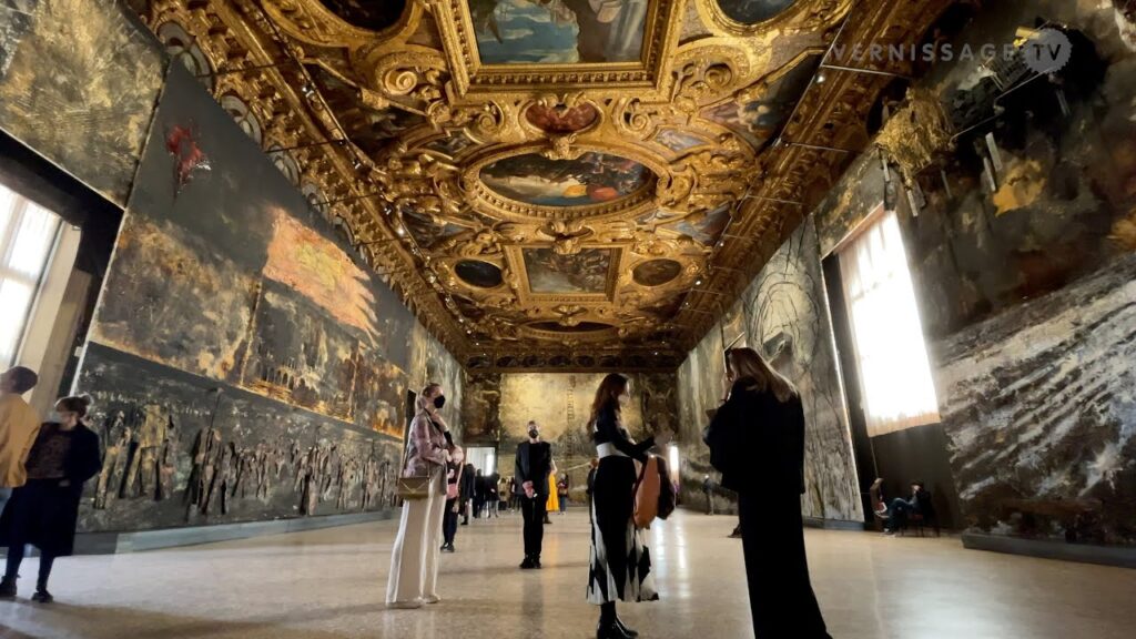
Anselm Keifer’s installation in Venice
Contemporary German artist Anselm Keifer, whose work we mentioned recently, has fulfilled a commission to “decorate” one of the most lavish and important buildings in the world, the 14th century Doge’s Palace in Venice. Keifer’s work in lead, straw, cement, burned books and other objects creates an incredible postmodern comment on spirituality and politics that is surely one of the great works of our century so far. There’s a YouTube tour of it here.


