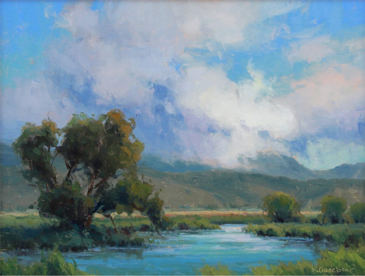
Kim Casebeer, Warm Reflections, oil on linen, 18″ x 24″ at Broadmoore Galleries
“Having your head in the clouds, even for just a few minutes each day, is good for your mind, good for your body, and good for your soul.”
– Gavin Pretor-Pinney
“Paintings of clouds are just what the world needs now,” proclaimed a recent piece in a Canadian newspaper on a veritable storm-front of art shows featuring clouds. “When the earth feels like it’s on fire, the sky – ever-changing, yet essentially the same – is a source of comfort and insight. Here’s how the professionals try to capture its chaos in art.”
It’s a fun piece, and the diversity of cloud paintings is unexpected and inspiring. However, it won’t help you paint your own clouds, and so we offer the following practical advice.
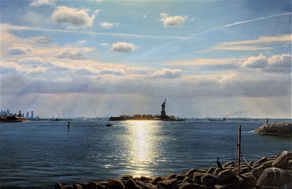
Joseph McGurl, Port of Entry, 24″ x 36″ – McGurl is a master of light on water and the clouds above
#1. Use your clouds as a design tool. Number one rule, always. It doesn’t matter where they are in real life, and it’s important not to just put them in randomly. Arrange your clouds strategically in relation to the rest of your painting; use them to balance directional shapes and keep the eye circulating within the picture’s frame. Think of them not as clouds but as shapes in the overall composition to be arranged in terms of placement, size, and directional pull.
In Port of Entry, above, Joseph McGurl balances long and short shapes in the sky and in the rocks and land masses below. He uses airplane contrails to form a sort of celestial bower or double arch over his main subject, the statue of liberty. Also, though the monument itself is right of center, it stands smack dab in the middle of the rays of sun light descending from above and on either side of it. Coincidence? Don’t make me laugh.
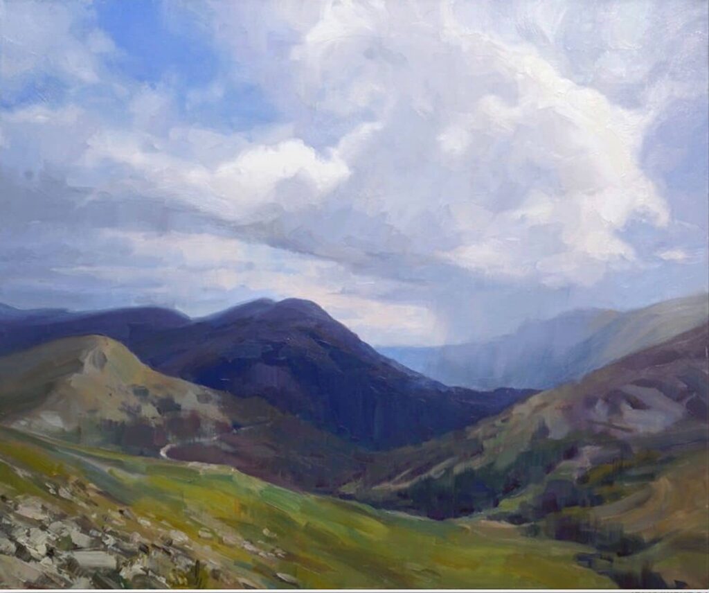
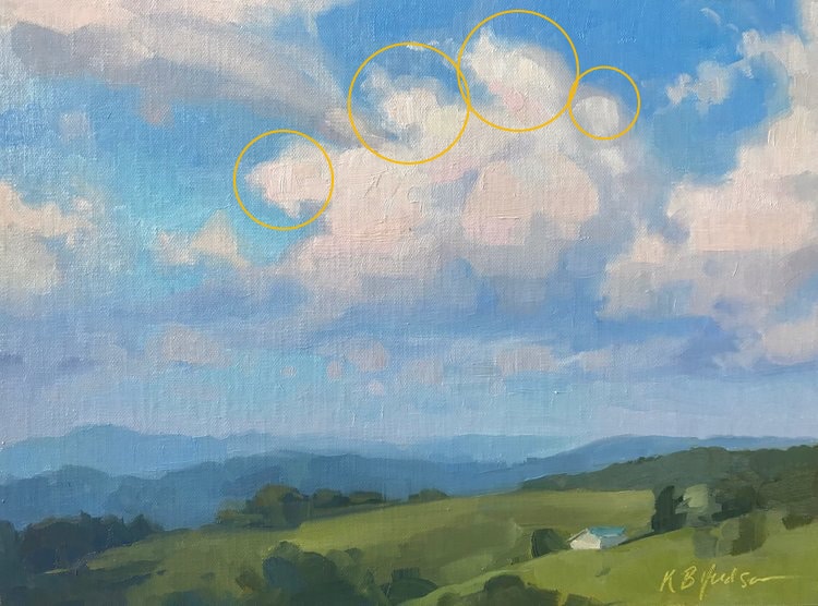
Kathleen Hudson, who teaches her realistic cloud techniques in her own video titled Clouds & Distance. The clouds are as important a part of the composition as anything else – here they reinforce the movement of diagonal shapes formed by the mountains converging toward the right side of center.
#2. Some artists paint the sky first, leaving spaces for the clouds. Others paint the clouds first, then put the sky around them. Either way, probably don’t paint the whole sky flat and then try to paint the clouds on top of it – it’s too much work. If you’ve painted the sky first and the clouds have a pasted-on look, hit some of the edges with a”dry” (meaning clean, no paint and no thinner) blending brush (like a fan brush or a filbert). Tickle the edges where the clouds meet the sky, leaving some edges “lost” (blended) and others “found” (harder-edged). And when you do this, aim your brushstrokes and pull your clouds’ edges in the direction the wind is blowing (doesn’t matter which direction, as long as you’re consistent – see #3).
#3. Clouds obey the wind and the light. Just as your landscape has a “point of light” or directional light that the shadows obey, your clouds have a “directional wind” that their edges obey. Vary the sizes, shapes, and placement of your clouds, but be pay special attention to angling the edges uniformly, as if the imaginary wind is blowing them all in the same direction.
Even though Cindy Baron in the below example uses her clouds to emphasize her painting’s point of interest and to enhance the overall perspective (see #4), you can tell the wind is blowing from left to right – all the clouds trail off in the same direction. Clouds also have a point of light, just like the land – see below again for where the light and shadows are located in relation to the setting sun not only on the ground but in the clouds and sky above it.
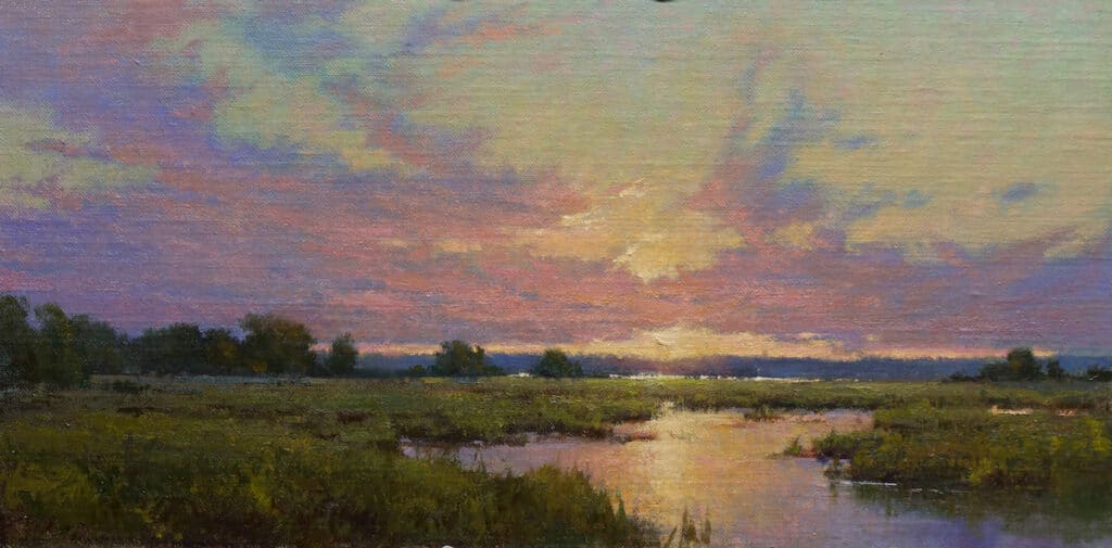
Cindy Baron paints clouds in oils and watercolors.
If your clouds are cumulous, treat the puffs like spheres, with a shadow side. Note in the cloudscape by Katherine Hudson below that the highlight (where the sunlight beams onto the curved edges) appears not at the edge but near it, with the clouds’ rounded edges getting less light as their surfaces curve away from the viewer.
Kathleen Hudon, Afternoon Sky, showing her technique for creating volume and treating clouds as 3-D masses
#4. Clouds follow the rules of perspective, both as a group receding in space toward a vanishing point, and as individual masses. All but the wispiest clouds are three-dimensional objects! Think of them as boxes – the bottom is (generally) parallel to the horizon, but their tops and sides should be shaped in perspective with the rest of the painting.
As noted, entire skies follow the rules of perspective too. Note how Cindy Baron (see example #3 above) uses her clouds to enhance the illusion of perspectival space, with all the lines converging at the point of the setting sun, which “just happens” to be going down at an ideal point of division around which the whole rest of the landscape is laid out in balanced perspectival proportion.
#5. A word about the sky. Some artists swear by a touch of yellow ochre or cadmium orange at the horizon, while others say the sky has to be cooler at the bottom and warmer at the top. Perhaps it depends on the time of day. Everyone agrees though that the sky is darker in value at the top and lighter at the bottom. Think of it as a dome – and in addition to shifting in value, it gets slightly warmer toward the sun and cooler as it “curves” away from it.
There’s a lot more to be said about painting skies and clouds, and these are far from hard and fast rules. This is painting, after all! (Rules? Ha ha ha!) But keeping a few guidelines in mind will at least give you somewhere to start.
Keiko Tanabe paints watercolors that often include fantastic, rhythmic, and dramatically lit skies
By the way, all of the artists featured in this post offer instruction and demonstrate oftheir methods and techniques for creating exceptional clouds and stunning skies in an amazing Clouds & Sky video compilation of 14 artists and their methods and advice for painting clouds. It’s a full course created for landscape painters, skyscape painters, watercolorists, and oil painters at any skill level.
May your clouds always drift and billow and sometimes even dance across your canvas. And may all your skies be blue.
Appreciation for a Modern Plein Air Pioneer
Louis Sloan, Frost Valley, 1995, Oil on canvas, 54 x 70 inches
Louis B. Sloan was an African American landscape artist, teacher and conservator. He was the first Black full professor at the Pennsylvania Academy of the Fine Arts, and a conservator for the academy and the Philadelphia Museum of Art. He’s gone underapprecitated for lots of reasons, not the least of which is he was a Black artist not making the kind of “Black paintings” the politicized art establishment of the 1970s through 2000 expected.
One of his former students has written an eloquent appreciation of Sloan’s art and the man himself. The piece begins: “The snow would be waist high and the temperature freezing or below. Lou would be Eskimo-like with his easel and brushes ready for action. This was a dedicated landscape painter, one of the best on the planet. Because he was such a dedicated en plein air devotee and practitioner, Lou had my immense respect, besides being a super sweet person and a ‘real human being.’”
Read the rest at Painters on Paintings.
Louis Sloan will be the feature of an upcoming issue of Inside Art. Stay tuned.
In the Paint,
Chris


